
BRAND IDENTITY / SCIENCE-LED WELLNESS
EQLEN: Science, in Harmony
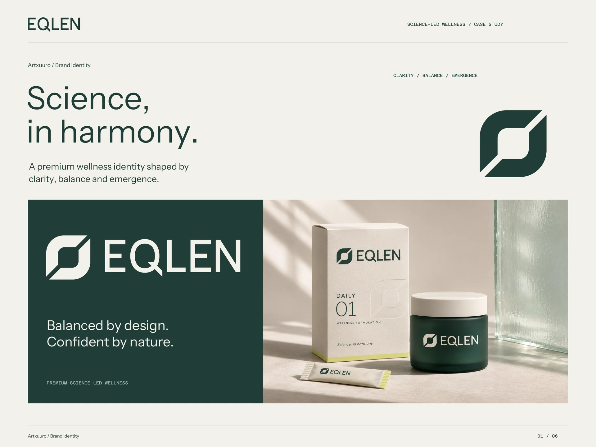
A premium wellness identity shaped by clarity, balance and emergence, with an abstract mark and a consistent visual language across packaging, print and digital.
Clear information.
Thoughtful design.
Overview
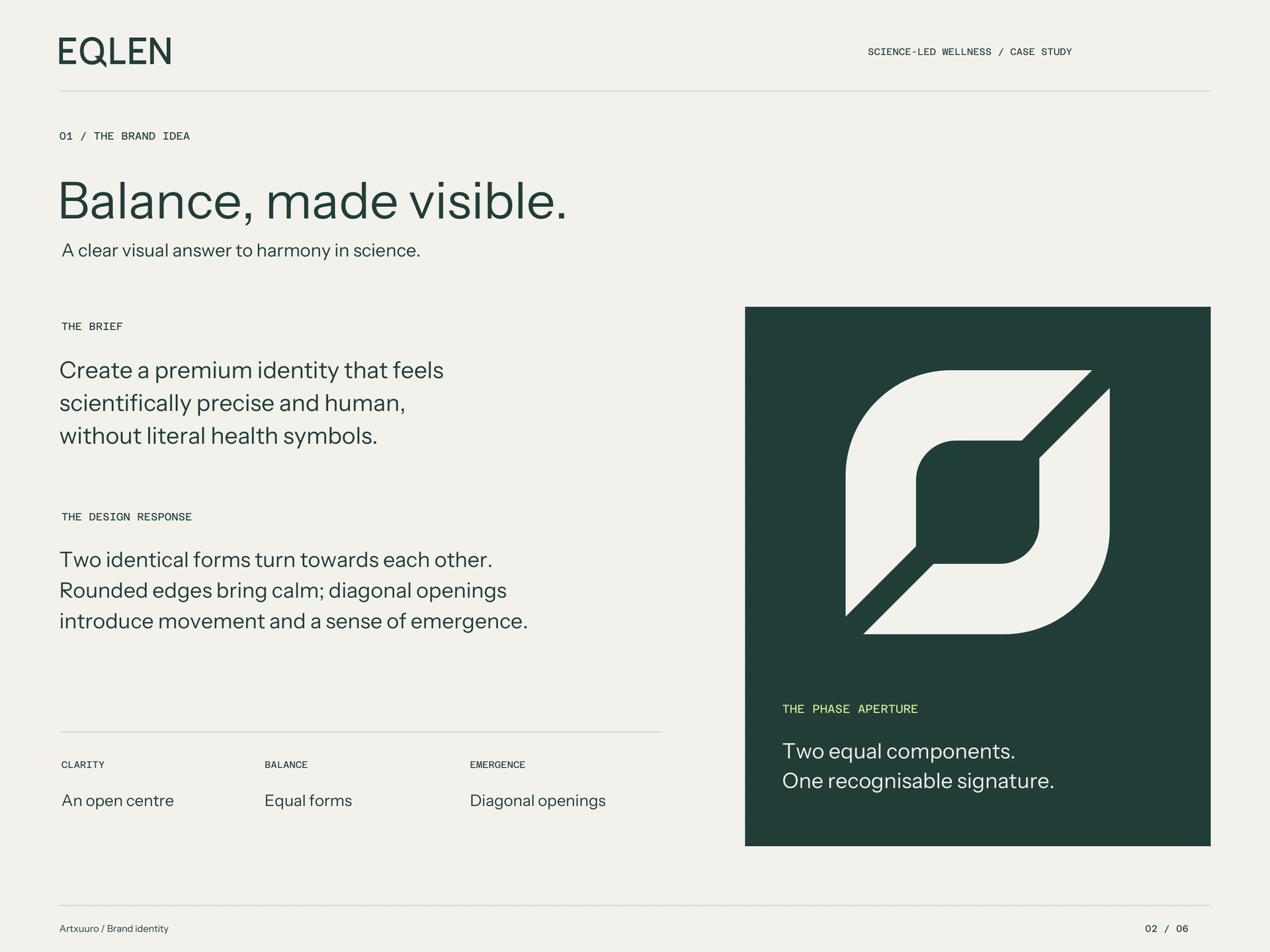
EQLEN is a premium science-led wellness identity concept built around clarity, balance and emergence. The brief called for a distinctive abstract mark and a confident wordmark, supported by a complete visual system. The aim was to express scientific precision and a calm, human quality through simple geometry and considered materials.
Our approach
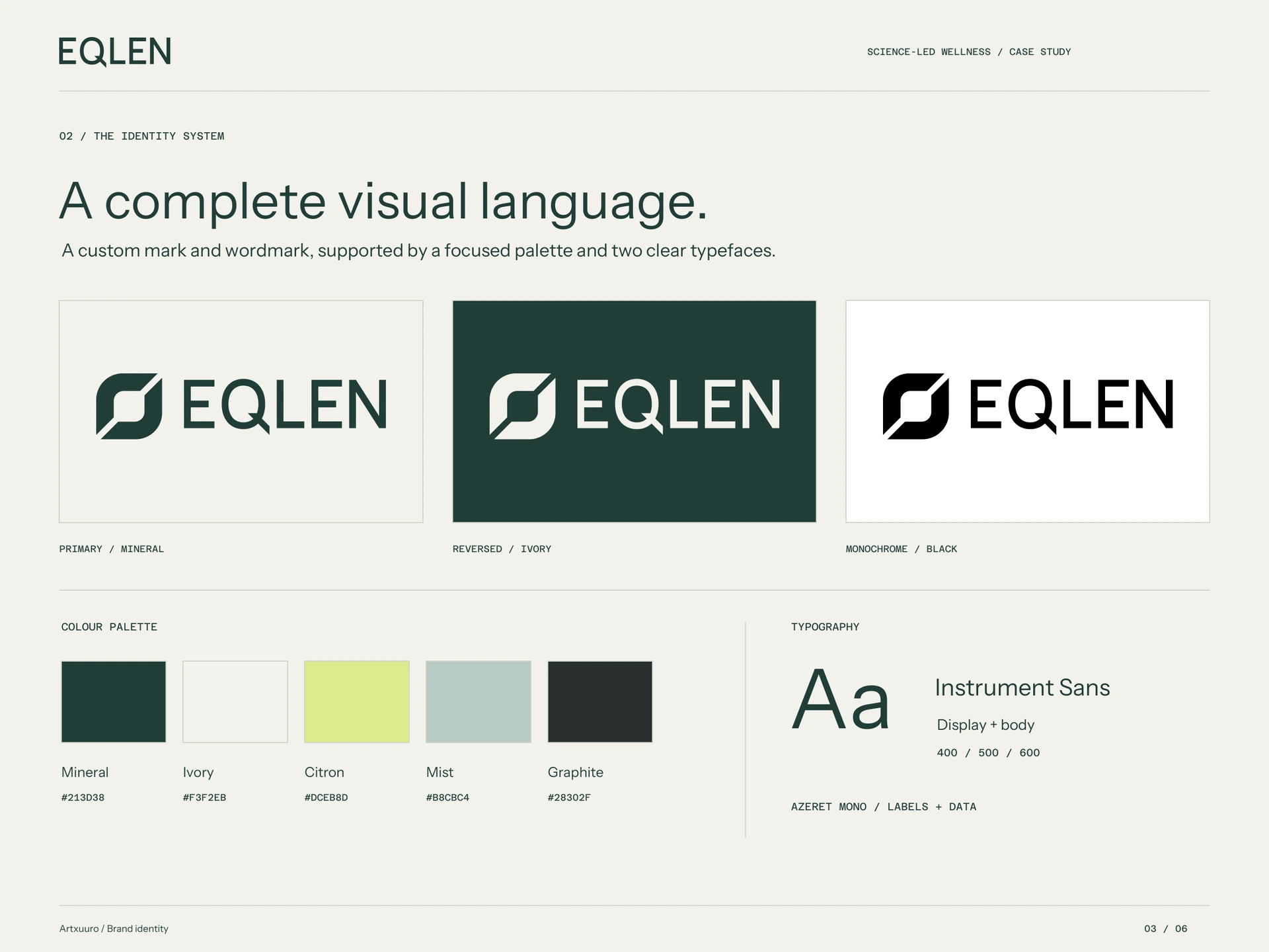
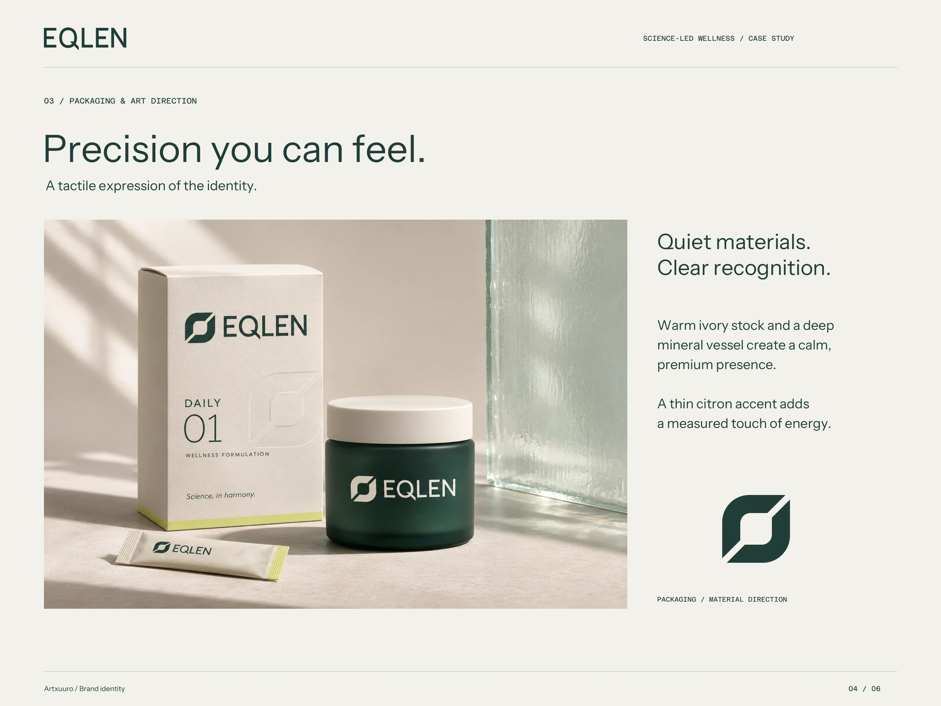
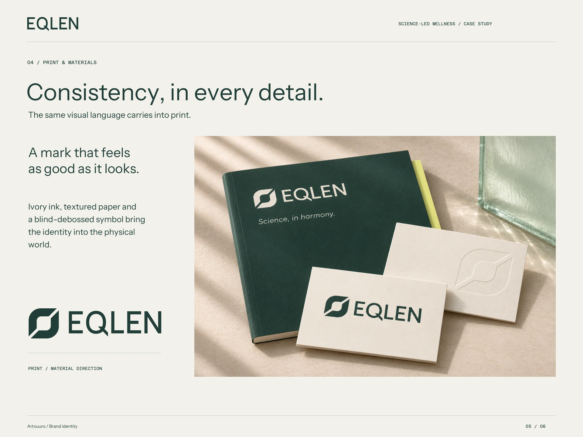
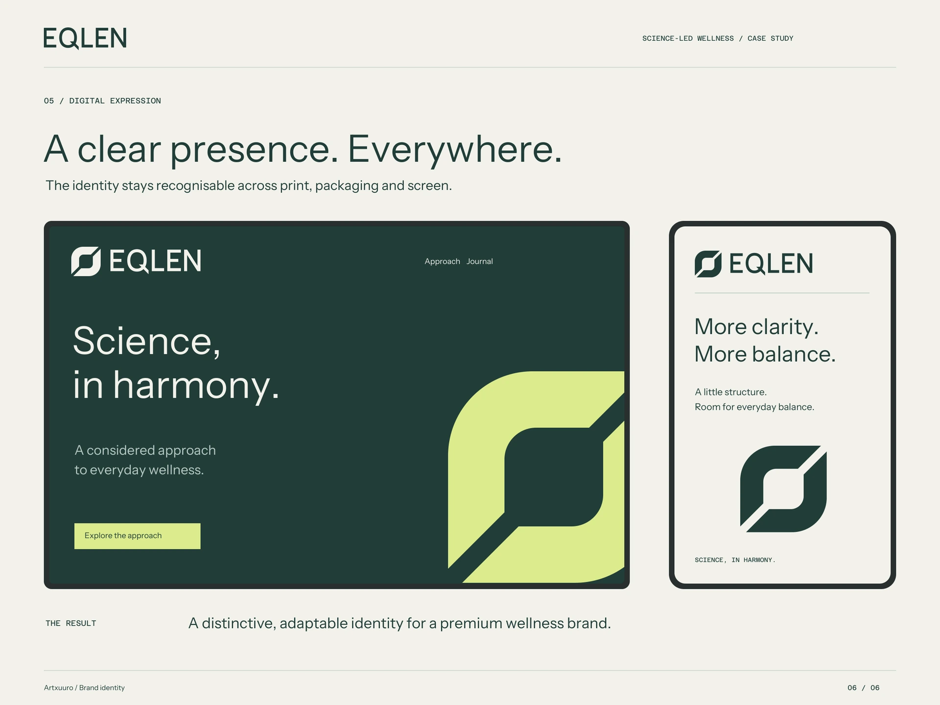
The Phase Aperture mark brings two identical forms into opposing orientations. Rounded edges create calm, while diagonal openings introduce movement and a clear centre. A custom geometric wordmark is supported by Instrument Sans and Azeret Mono. Mineral green and ivory establish the main palette, with citron, mist and graphite adding contrast. The visual language extends into logo lockups, monochrome editions, packaging, stationery and digital applications, supported by a 16-page identity guide.
Work shown
Abstract brand mark · Custom wordmark and logo lockups · Colour and monochrome editions · Colour palette and typography · Brand usage guidelines · Packaging and stationery concepts · Digital art direction · Six-page design case study
Have a project
in mind?
Tell us about your presentation, report, or brand design project.
Discuss a project ↗